
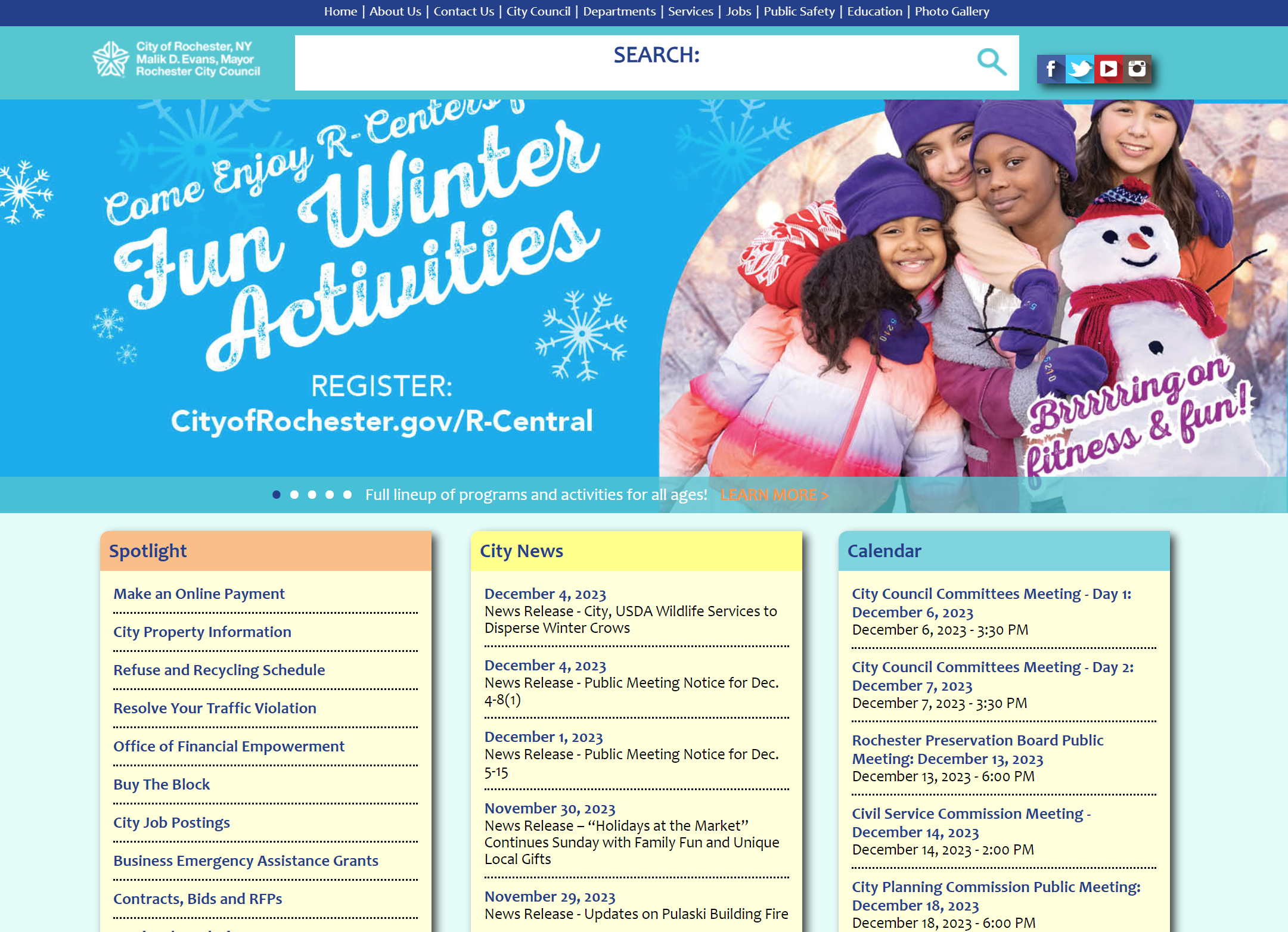
This project focused on revitalizing the government website for the wondrous Rochester, New York. After all, a beautiful city should be reflected in a beautiful site—but the city of Rochester's website is just a bit antiquated and cluttered.
The redesign focuses on reducing redundancy in terms of both visuals and user flow, opting instead to streamline the user to their desired information, aided by simple, elegant, and unified graphics.
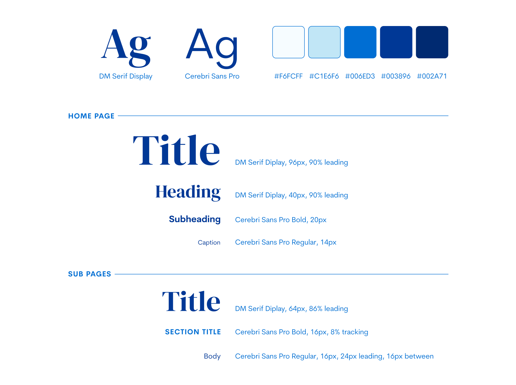
Headers
Cards
Style
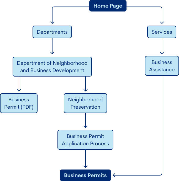
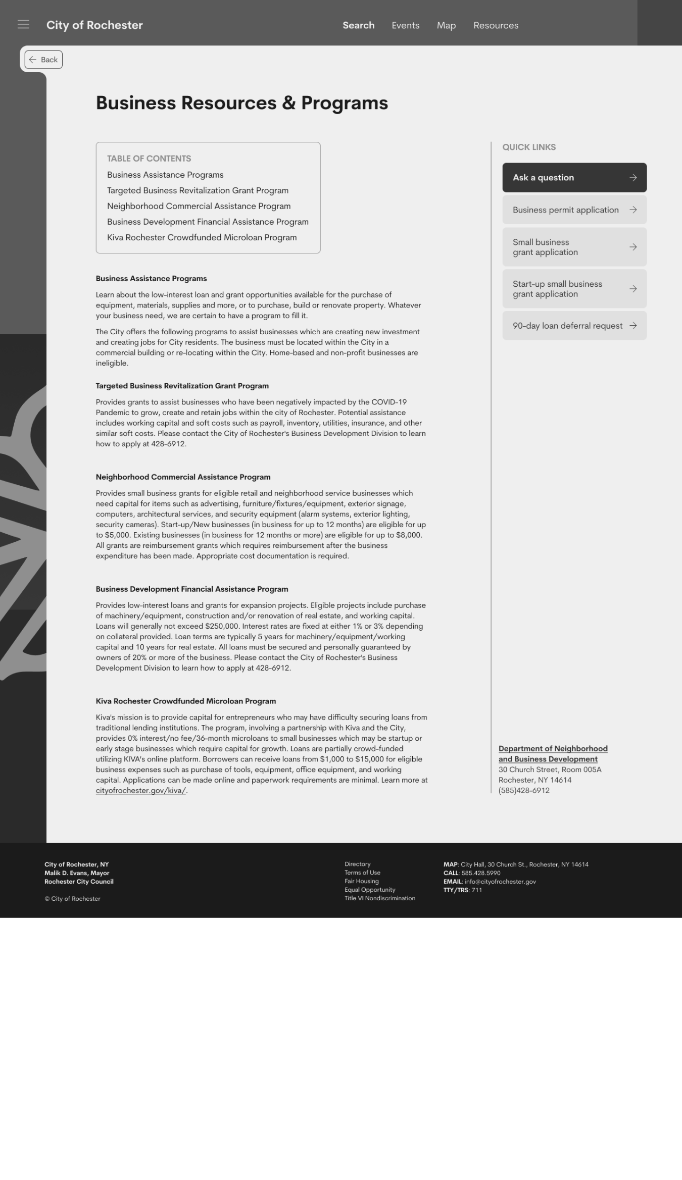
THE TASK: find information on the business permit application process
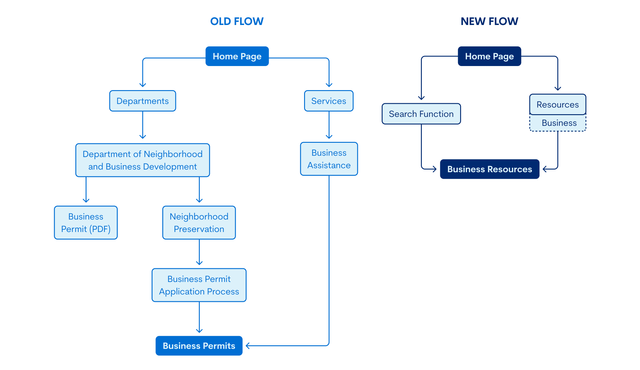
The current user flow has an overwhelming amount of ways to get from the home page to the desired page, information on business permits.
Generally, there is a lot of repeated information in different places, and a confusing amount of redundancy in the site map pathways.
Visuals
Functionality
boston.gov - The city of Boston has a clean, elegant website with a cohesive color scheme, readable fonts, and a simple yet modern layout. It feels bright, friendly, and welcoming while maintaining its mature and informative appearance. The information displayed on the home page is based on popular searches, making the content relevant to the general viewer. However, if you have something that isn't one of the dozen or so “Featured Resources”, it may be a little more difficult to locate upon first glance.
sanjoseca.gov - The city of San Jose's website features several more images than Boston, but it remains well organized, unified, and easy to use. Their information scroll order, similar to Boston's design, is based on resource popularity. The first items on the home page are “top requested” resources, followed by a search services function. This search services feature is a very useful tool for users because it addresses all possible demands with an open-ended search query (in addition to an alphabetized list).
sf.gov - San Francisco is the most minimalistic of the three, using grouping and white space instead of colored or outlined cards. Still, the consistency in text treatment and color scheme keeps the site cohesive. There is, however, a bit of redundancy in the “Services” navigation tab, as it is simply the top section of the home page—as its own page. SF also features the public officials more prominently than the other two, likely out of publicity because it's such a large city.
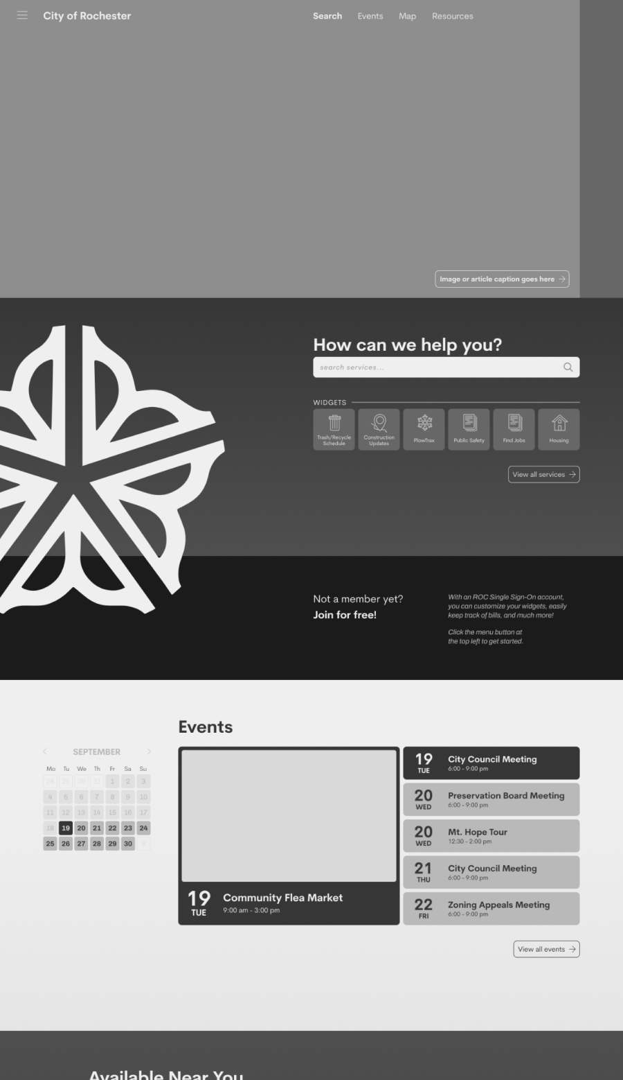
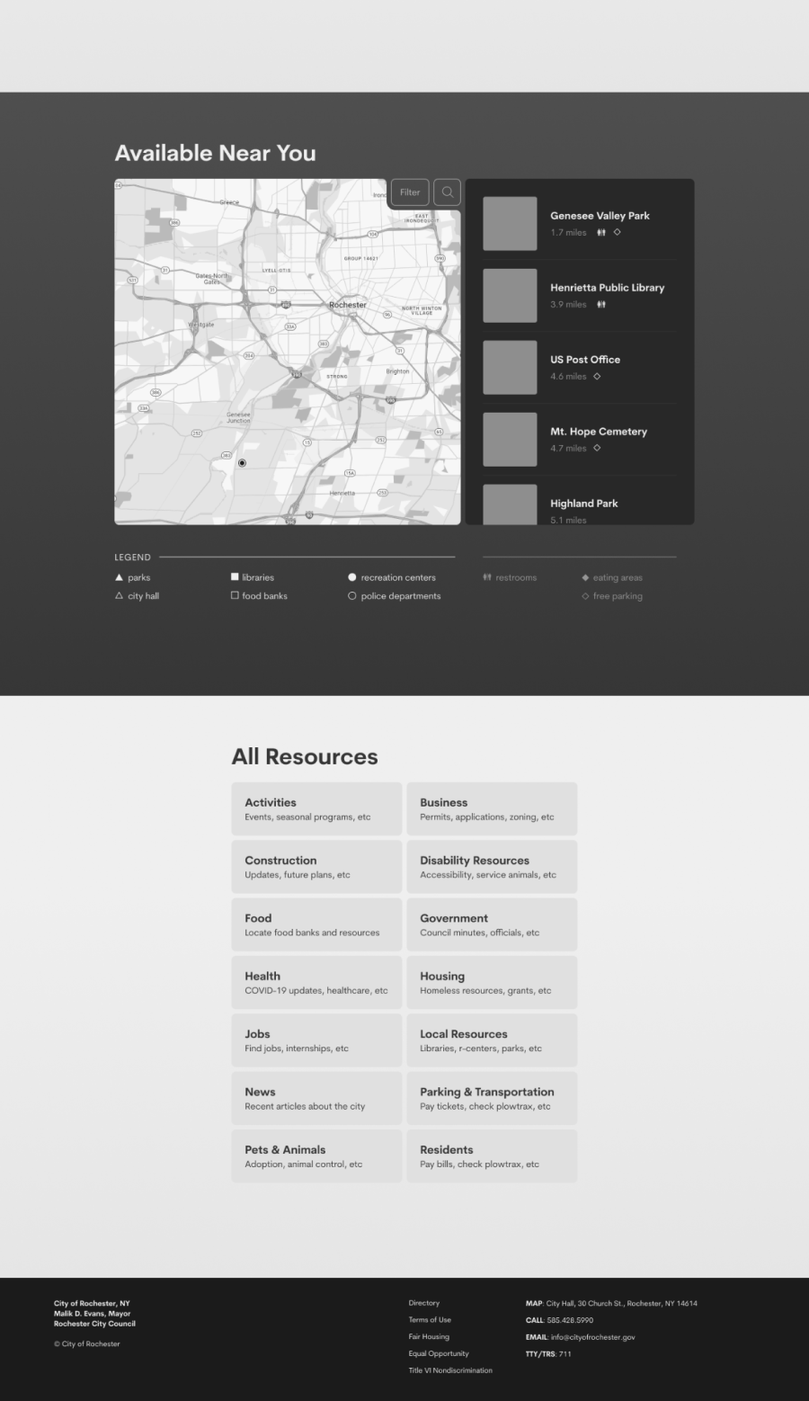
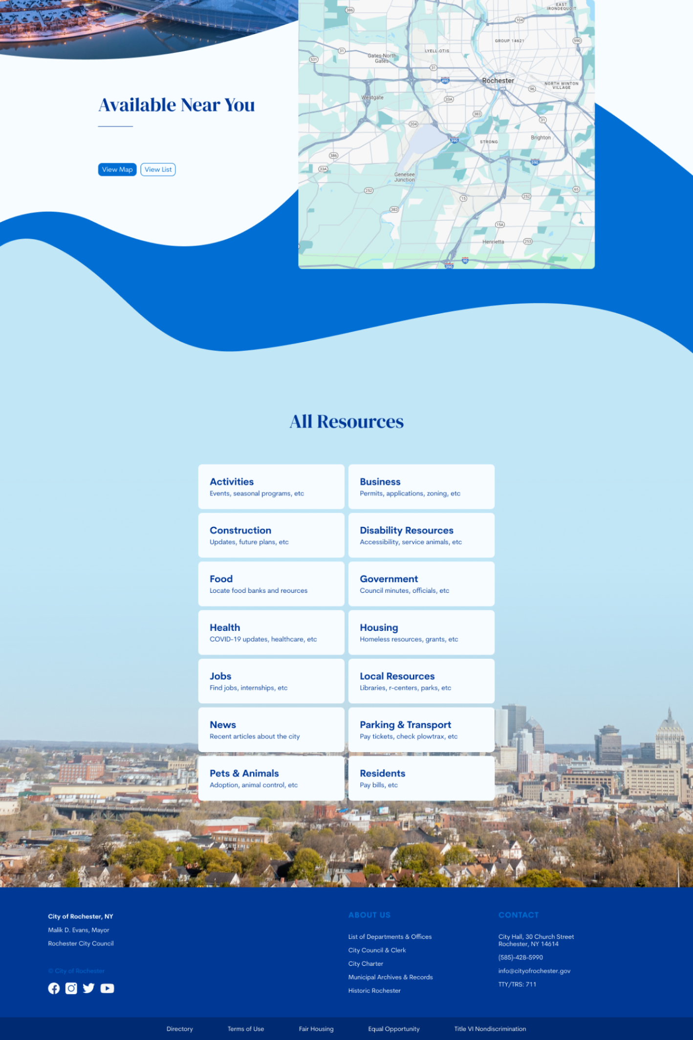
Popular Resources
Having a “featured resources” or “top requests” section on the home page quickly addresses the needs of most users. Prompted search bars can similarly fulfill this function.
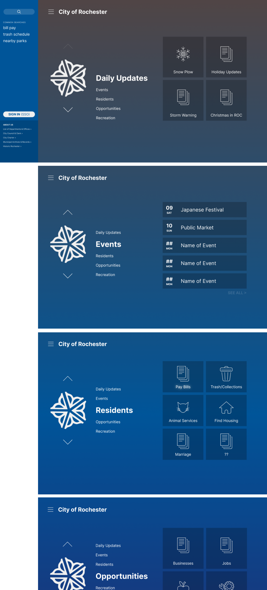
Icons
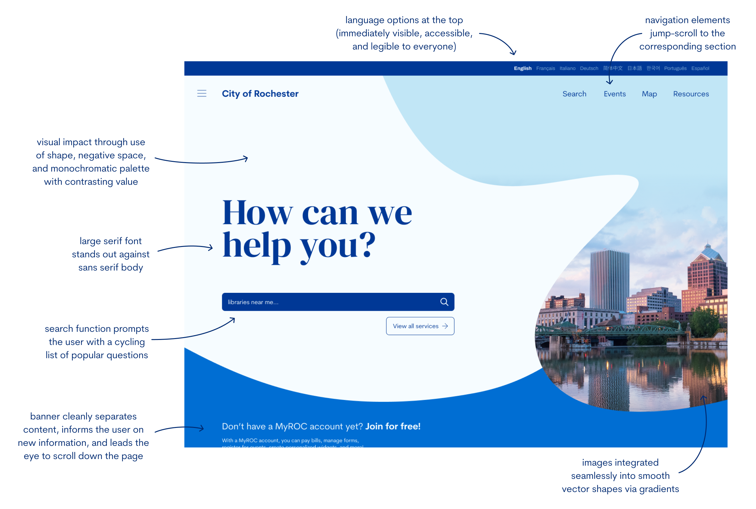
Utilizing icons in addition to text labels increases scannability (isomorphic correspondence).
Scrolling Sections
Dividing information into clear, contrasting sections with titles helps users quickly differentiate and find information.
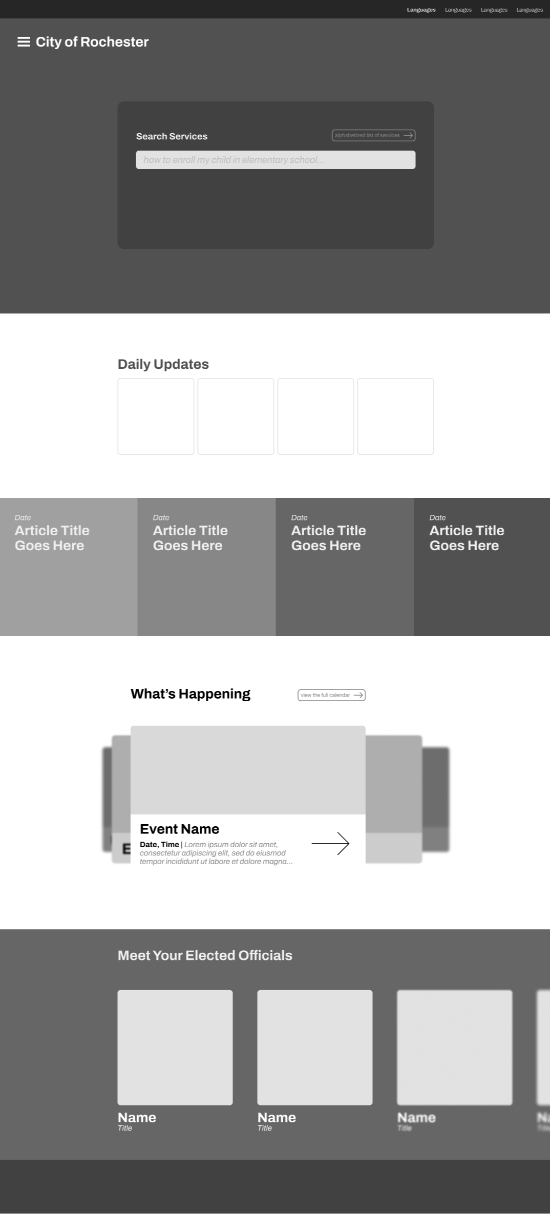
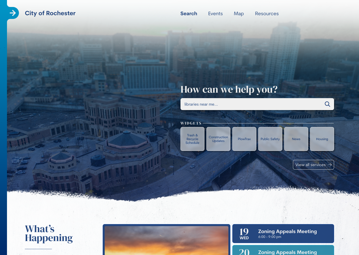
Reduce Clutter & Improve Relevance - By reducing the information on the home page to disclude repetitive or generally irrelevant topics, the user will be able to more quickly find what they need. Information will be displayed on a timely need-to-know basis, as opposed to having the home page feature everything at once.
Revitalize the Style - Redesign the layout, brighten up the color scheme, and increase white space to help the page feel more unified and more inviting. It will ease the user into the information, as opposed to overwhelming them with boxes and text.
Increase Scannability - Separate information into clear, differentiated sections and use more images and/or icons to help the user more seamlessly scan the site and find the information they need.
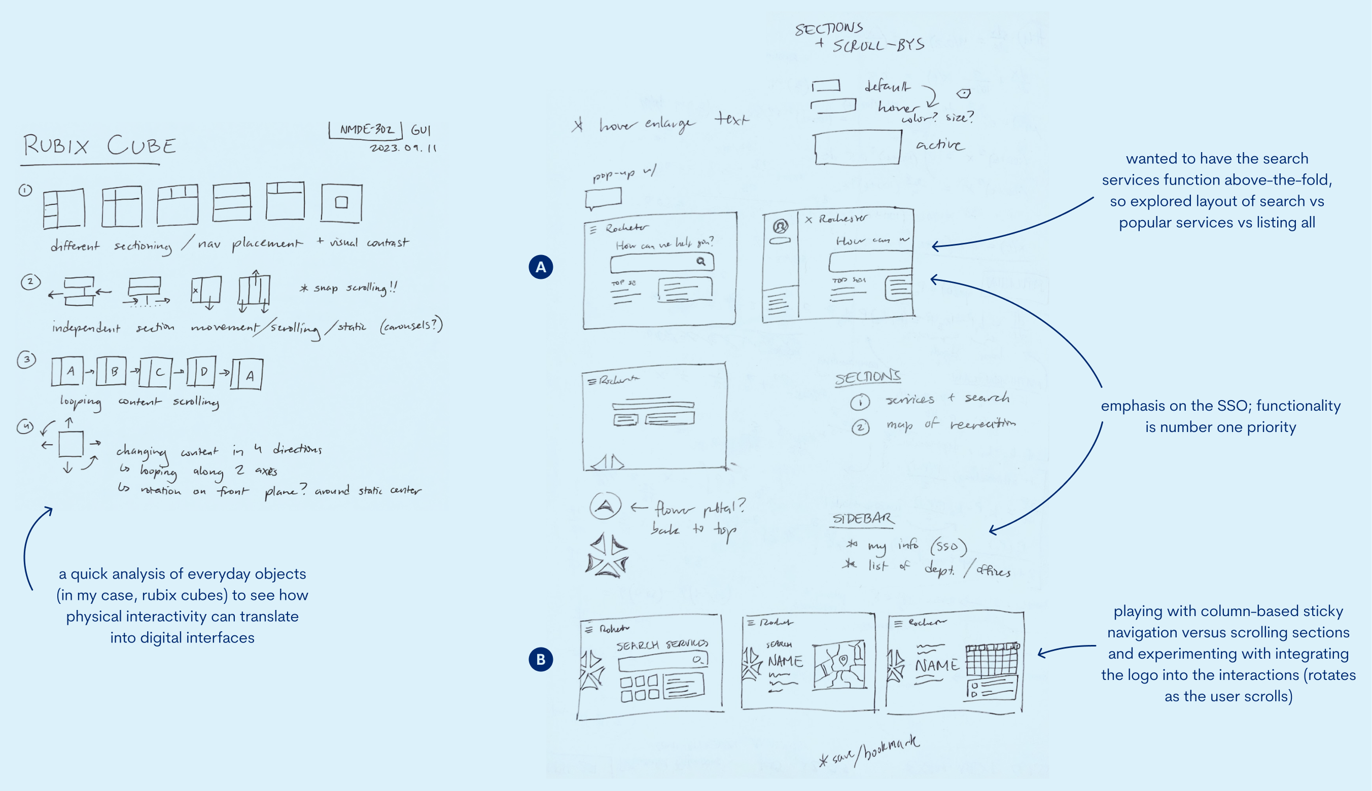
The version on the left (Version A above) was a more traditional layout without fixed navigation at the top and clear sections. Still, I tested different ways of displaying information; events was especially interesting in terms of how much to display at once and how the user could interact with each card.
In the version on the right (Version B), I experimented with the logo and section scrolling. Despite the interesting method of scrolling, it ended up being an inefficient use of space, and was not optimal to easily and readably display image.
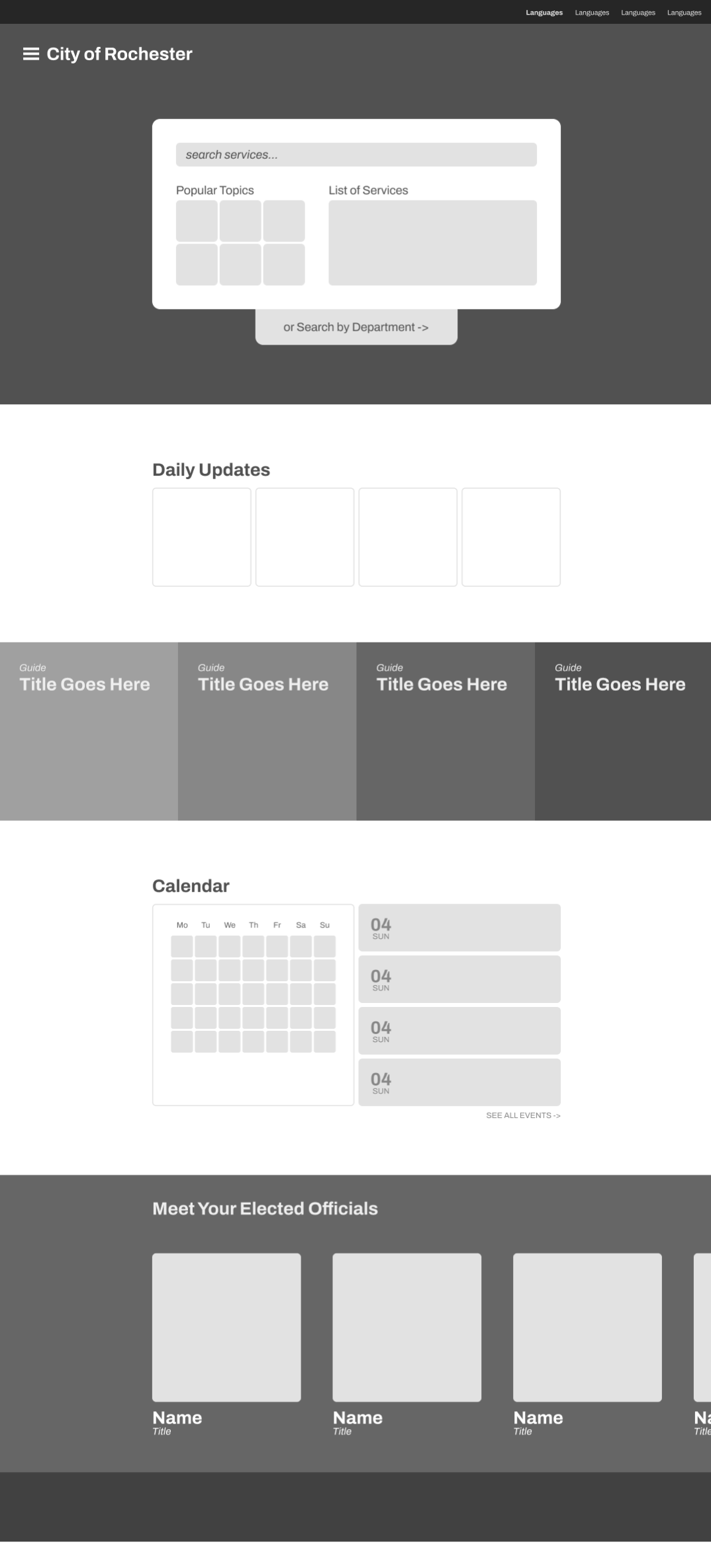
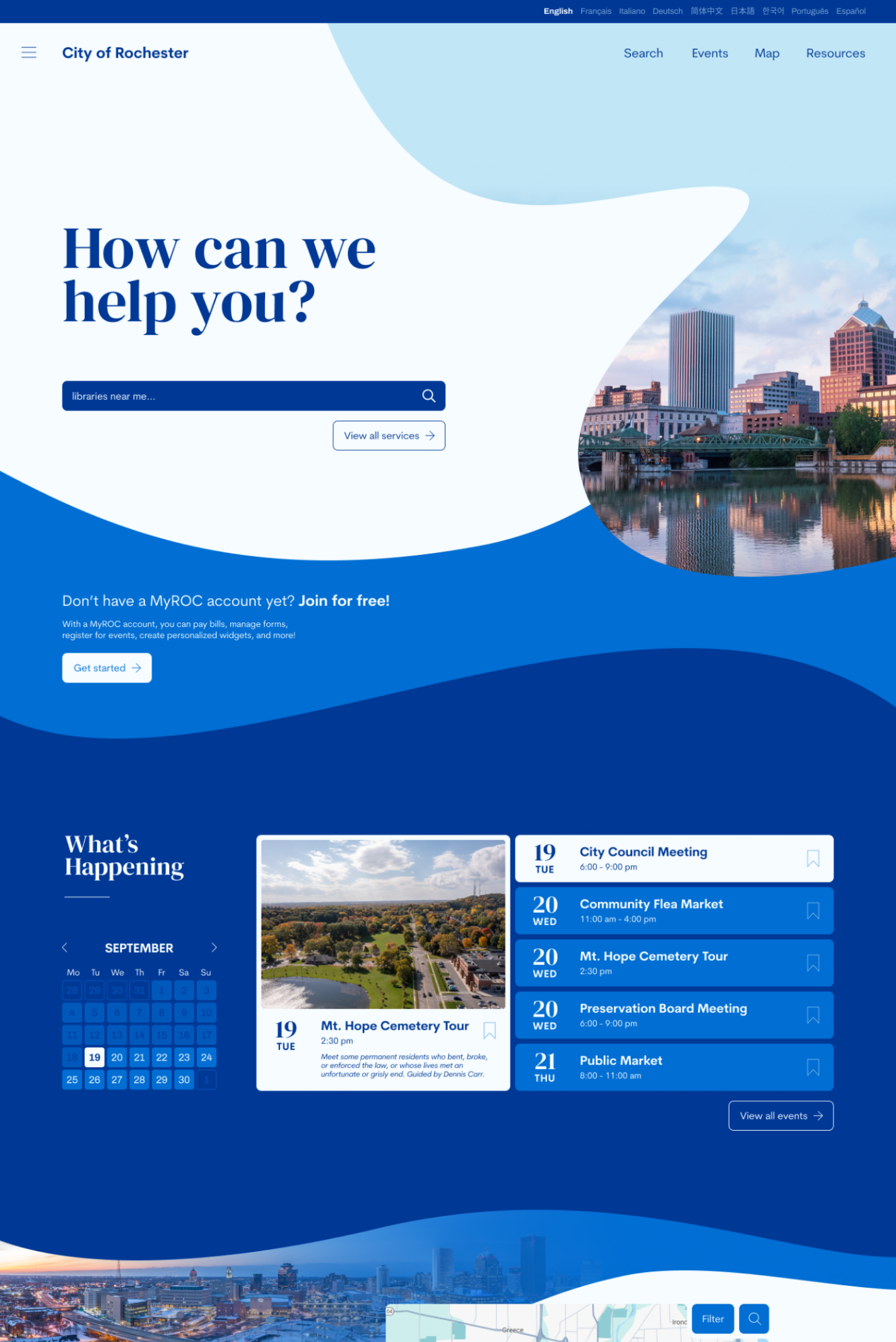
For the home page, I refined the layout, added body copy, and differentiated the sections more through adding background with contrasting values. I also created subpages including a Business Resources informational page, as well as an interactive application form.
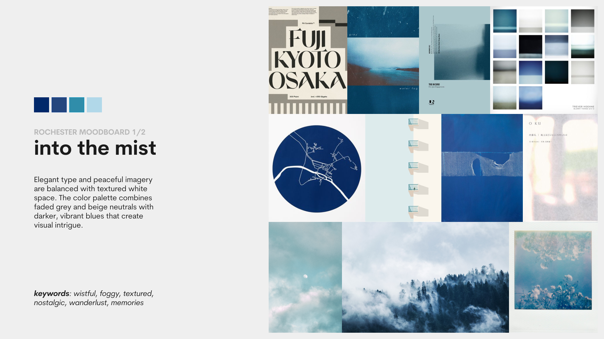
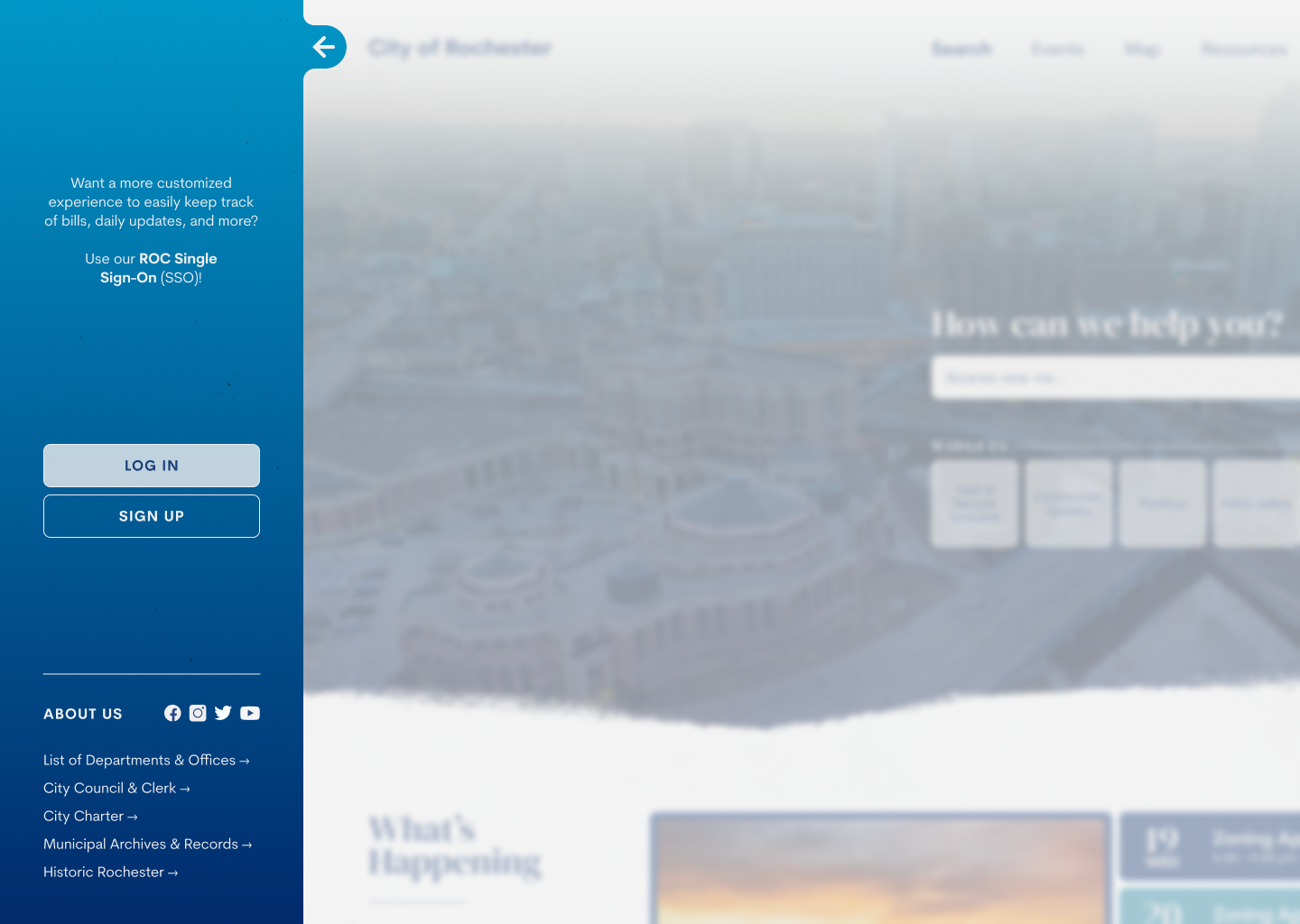
For Into the Mist, I focused on the contrast between rough textures and smooth, blurry glassmorphism. The color palette was monochromatic with emphasis on Rochester's iconic blue, though it makes the overall appearance feel colder and less friendly.
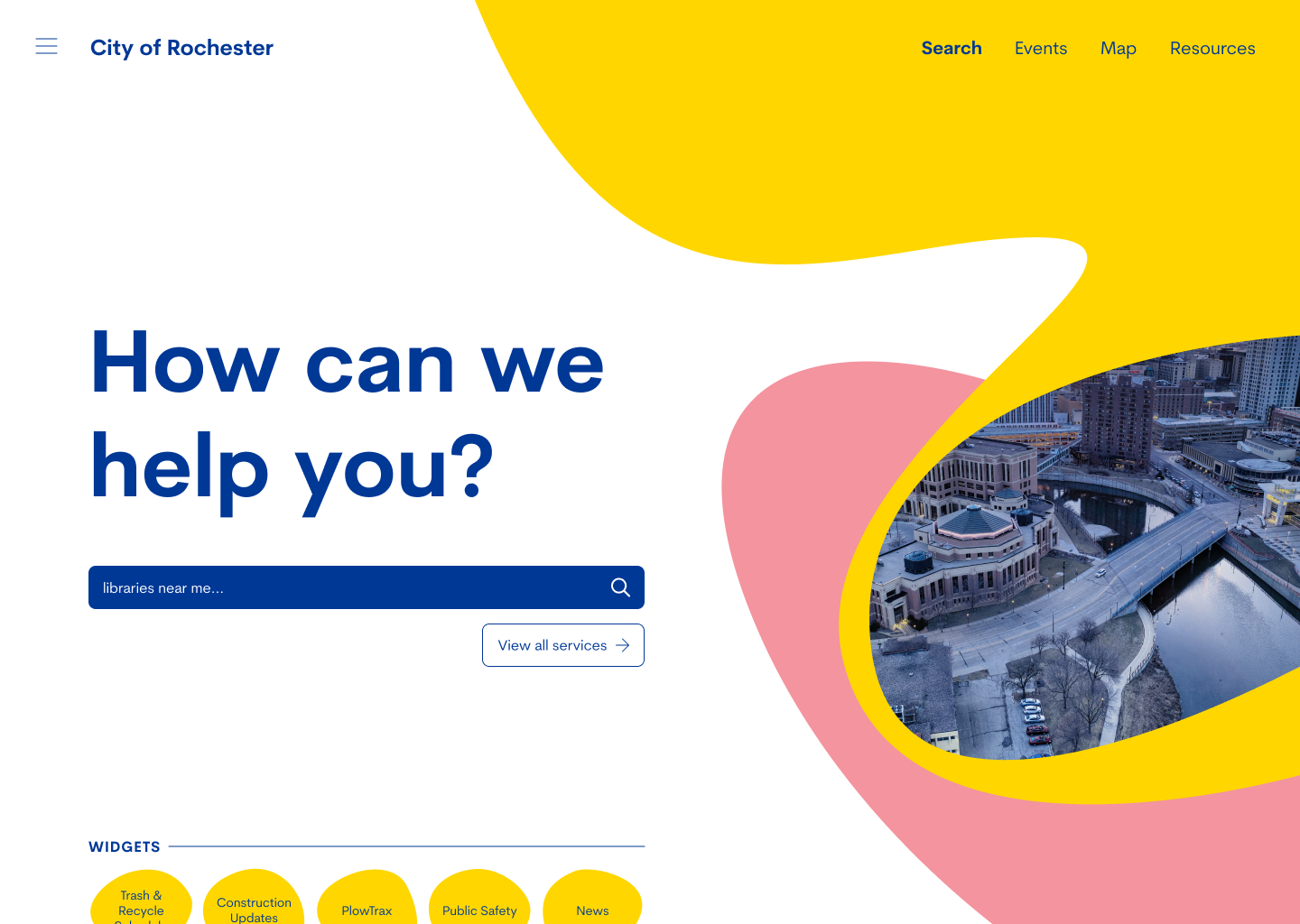
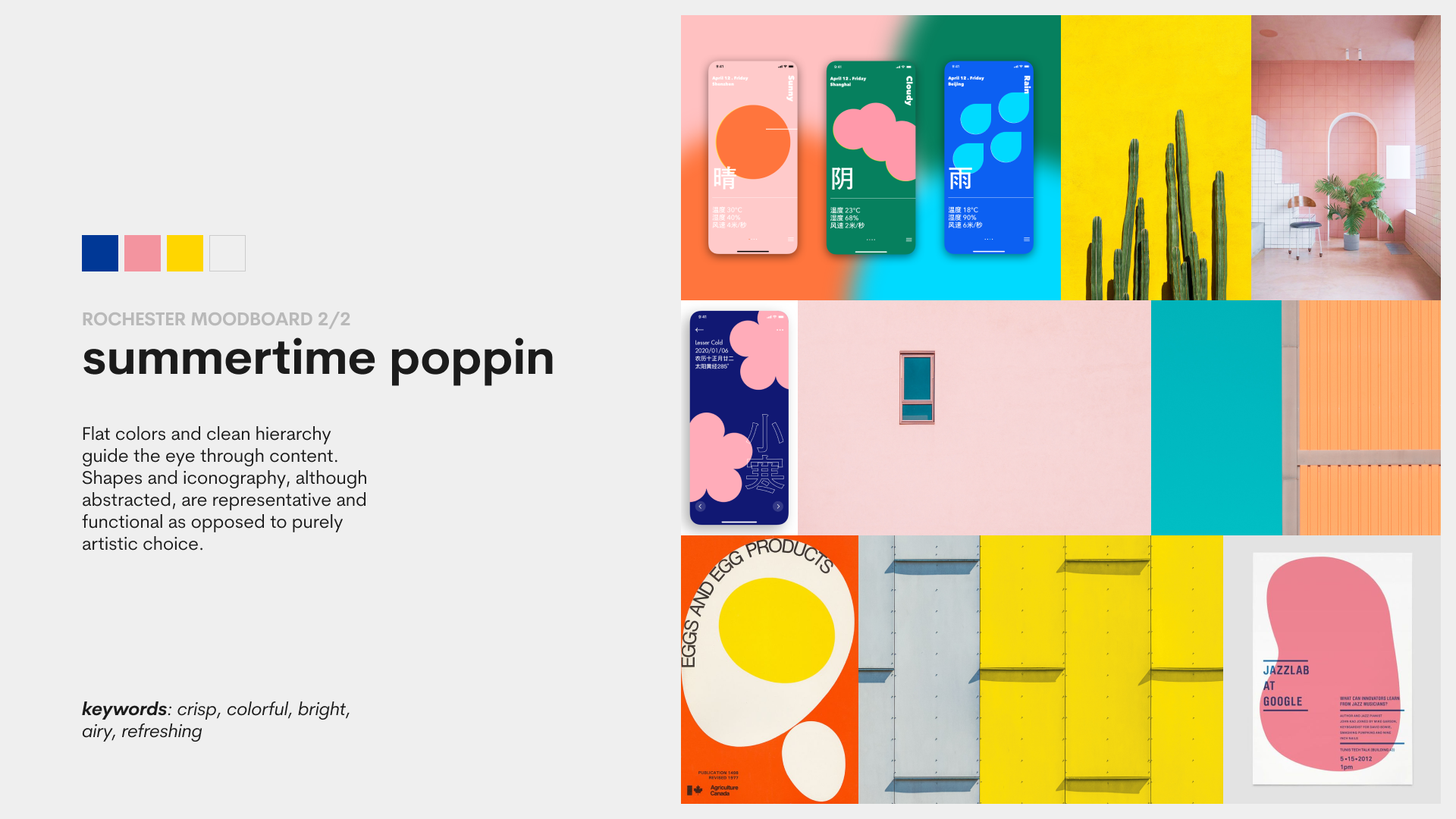
Summertime Poppin is more upbeat and modern, with crisp, sloping lines, bright colors, and lots of negative space. The abstract shapes and lack of a classic hero image makes the overall appearance less traditional, but does not detract from the functionality nor visual appeal.
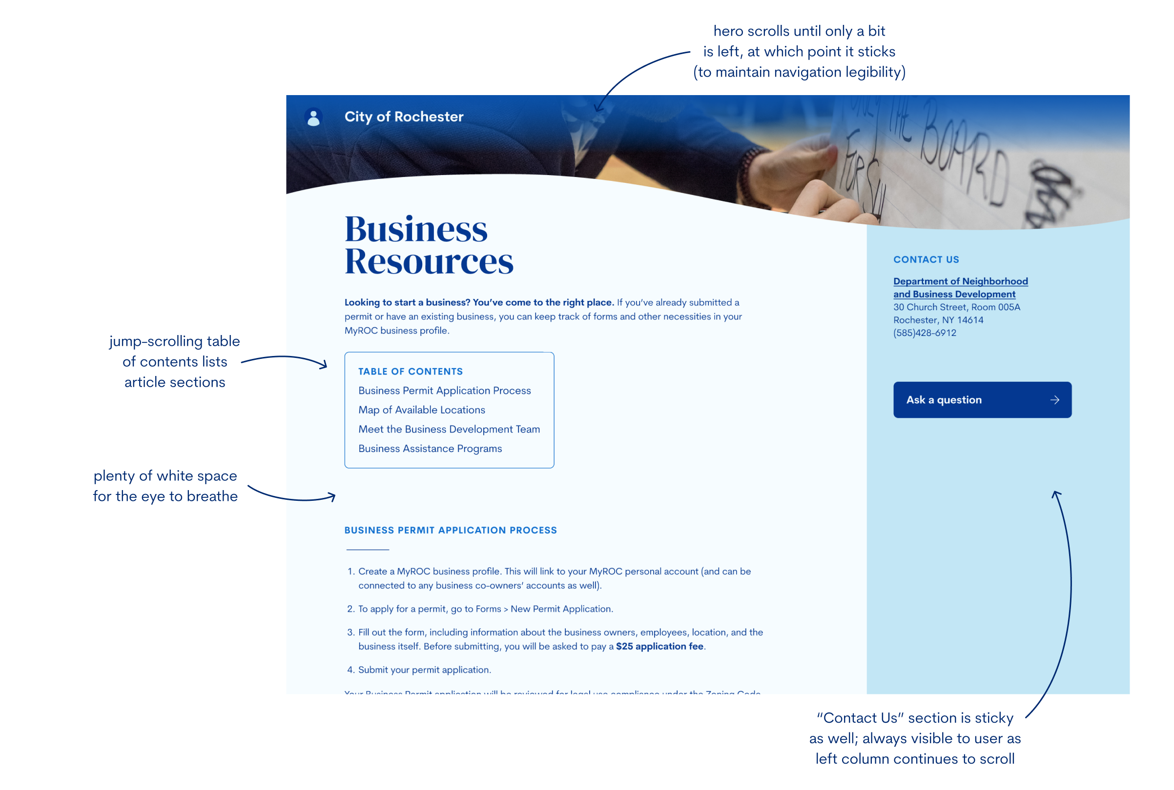
The old flow was overcomplicated, unfocused, and a generally confusing experience. With this new flow, the user deals with significantly less redundancy, and all the desired information is centralized in one concise, all-encompassing, easy-to-navigate page.
After many iterations, I opted for a final design that felt fresh, welcoming, and friendly, yet maintained both functionality and professionalism. A monochromatic color palette and gradient-faded photos create visual intrigue, while well-balanced negative space and composition of content eases the eye through the page.
While my intended user flow targeted people looking to start a business in Rochester, I created a home page that simplified and unified all resources, allowing for anyone of any background to easily navigate to their desired information.